
THUAS Connect
University Companion App
The Hague University of Applied Sciences needed a unified platform for its 30,000+ students—something that could simplify access to events, news, schedules, and campus communication.
My Role
Lead UX/UI designer, working in a small team of five. I joined early and handled everything from foundational design system work to high-fidelity flows, collaborating closely with the other designer and developers.
01. Understanding Student Needs
Students were juggling multiple disconnected platforms. We started by mapping their daily journeys and pain points.
We conducted interviews and shadowed daily routines. Key insights:
Many students didn’t check campus news due to lack of visibility.
There was no single place to see events, plan days, and connect with peers.
Communication tools felt fragmented and outdated.
This informed our core hypothesis: a single, streamlined hub could reduce friction and boost campus engagement.


02. Designing a Frictionless Foundation
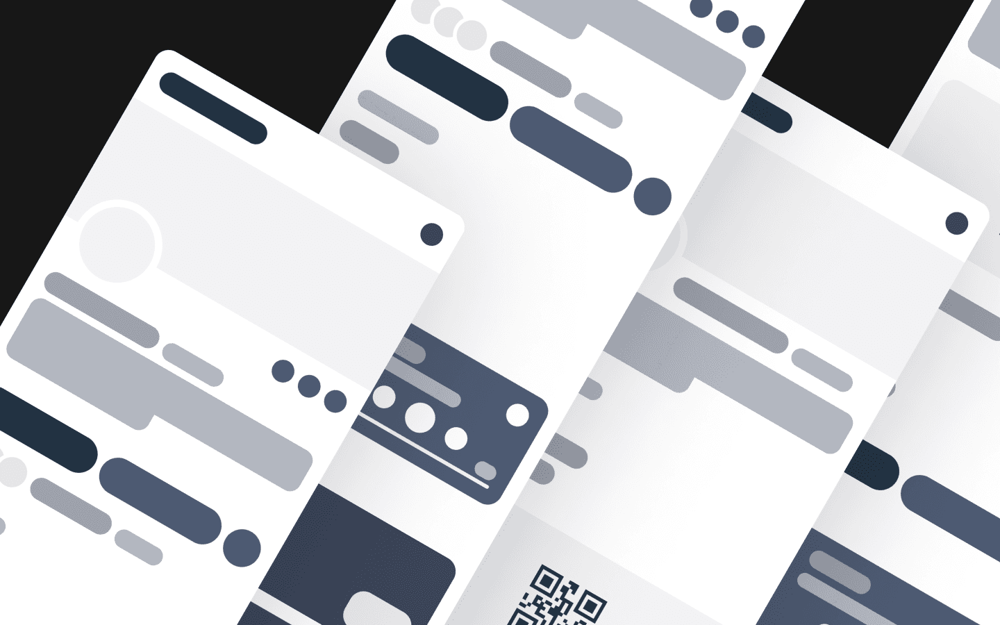
Early on, we built a minimalist design system to scale fast. Inspired by token-based systems (like Uber’s), it emphasized clarity and responsiveness.
We prioritized:
Visual hierarchy to guide students intuitively.
Minimal interfaces to reduce learning curve.
Mobile-first patterns, given heavy usage on-the-go.
Components were tested in isolation before assembling them into flows, reducing rework and clarifying user expectations.

03. Collaborating in an Agile Team
We worked fast. Lo-fi wireframes were shared early with developers, then iterated into hi-fi mockups. Design decisions were documented clearly to ease handoff.
Despite working across locations, async reviews and structured naming conventions kept communication smooth. We never had to re-explain a file.
04. Iterating with Real Users
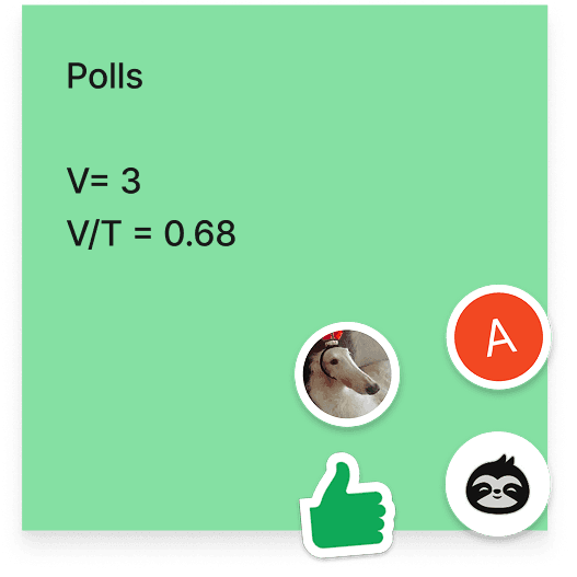
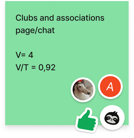
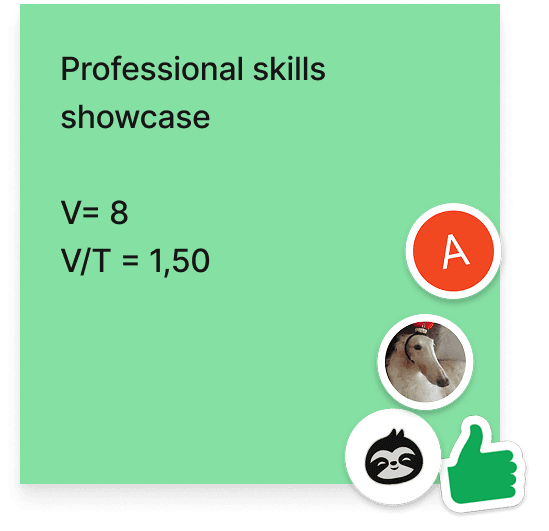
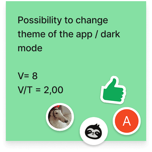
Each major flow went through 2–3 design iterations based on testing with students from 10+ courses and 4 faculties.
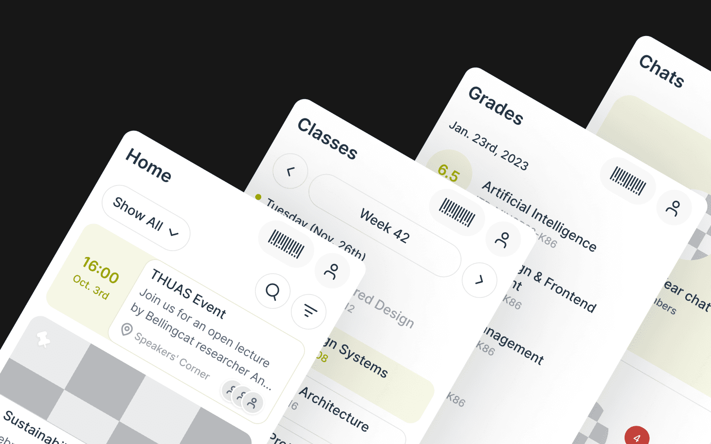
Home feed was reshaped by merging News and Events—students preferred one scrollable stream.
Chat was simplified to highlight key contacts and quick replies.
Navigation was reduced to 4 primary tabs, keeping the app feel light and focused.
05. Outcome & Reflection
The app was fully designed, developer-ready, and went through multiple testing rounds. Administrative delays slowed the launch, but the project became a strong blueprint for future digital campus tools.
Students didn’t need an app that did everything—they needed one that made it easier to do anything. By simplifying the everyday, we reduced friction, built trust, and gave them space to focus on what really matters.